Responses by Elise Cropsal; creative director, branding and design; LG2.
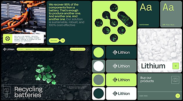
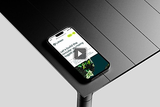
Background: We were brought in to help lithium-ion battery recycling company Lithion position itself as an innovative leader in its sector, developing a strong brand identity that inspires confidence. The mandate included building a new website that would be flexible, complete and connects emotionally with all of its target audiences. Lithion operates in a B2B model but is also in the energy transition space, so we had to keep government audiences in mind as well. With Lithion’s growth plans, we were also required to position the company as a mission-driven employer.
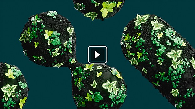
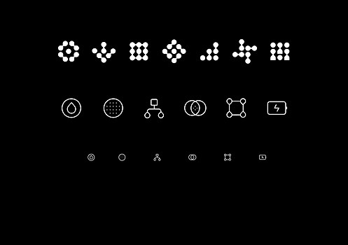
Design thinking: The identity had to be very digital, technological, innovative and sophisticated. We wanted to find a graphic system that combined the rational (science) with the emotional (human). We also wanted to highlight what Lithion, through its process, is trying to safeguard: nature. We asked ourselves: How could we show nature through unique imagery?
Challenges: The fact that Lithion is a startup and its marketing team has many different responsibilities meant that we had to be agile; work closely with the client; and find unique, relevant solutions while evolving with their changing needs.
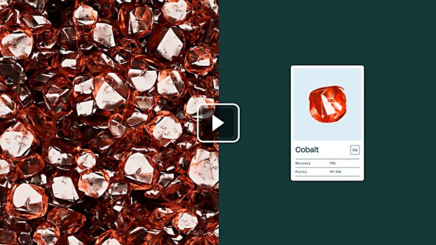
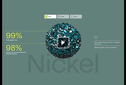
Favorite details: Among other things, I’m really proud of the team’s representation of minerals in 3-D—special thanks to Samuel Thibodeau. It's not just a matter of aesthetics; we had to work closely with the client to ensure that the quality of critical materials at the end of Lithion’s recycling process was sufficiently realistic. We even went back to studying chemistry for it!
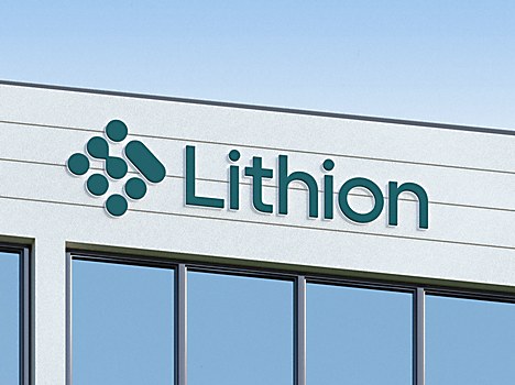
Specific project demands: One of the harder things was that we had to work with the existing Lithion logo. The client had an attachment to it, and it was the only thing in the old platform with some notoriety. In the end, the notion of circularity was incorporated directly into the refreshed logo. By preserving it from the original brand platform and reworking it for greater impact and strength, we literally recycled it. It was also important that the client’s website be self-service, that its platform integrate with the new brand copy and that its images be done in-house. We had to adapt some designs to ensure they also functioned properly within these constraints.
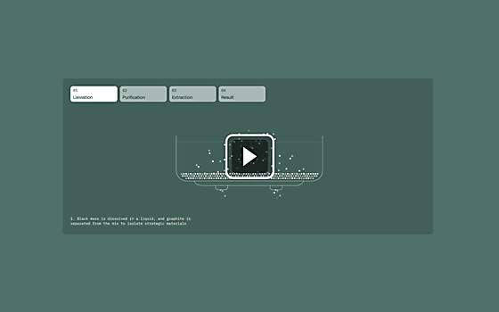
Visual influences: The guiding principle for the 3-D visuals was to represent Lithion’s unique technologies as accurately as possible while still visually aligning with the brand platform. We treated the minerals like we would jewels, presenting them as exponentially bigger than they are to let people see and—more importantly—feel at a glance the quality of the critical minerals the recycling company extracts. Using the surface texture of black mass, a byproduct of Lithion’s proprietary wet-shredding technology, we created an animation of vegetation pushing through to visually represent how the company helps create a greener world.


