Responses by Giorgia Sage, designer, The Office of Ordinary Things.
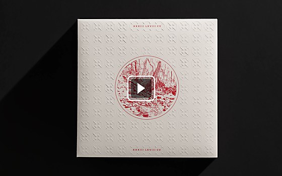
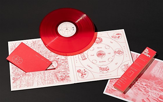
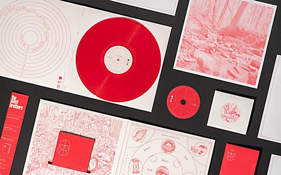
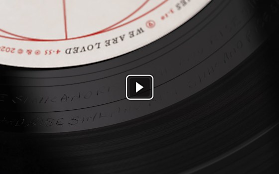
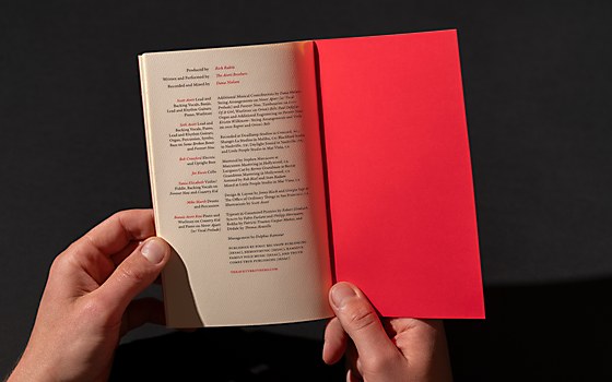
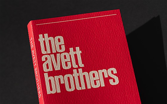
Background: As the focus of folk rock band The Avett Brothers’s music has shifted to the realms of spirituality and embodiment, they wanted the release of their newest record—a self-titled album—to be an entire ambient experience for fans. The rich, textural, symbolism-driven design of the packaging creates a spacious container for listeners to engage with the music and enter the world of the album.
Design thinking: From the very first discussions with the band, we knew it was essential that every aspect of the design carry distinct meaning and resonance and be constructed with intention. We set out to develop a “Poetics of The Avett Brothers” through our design process. So, every decision we made was substantiated by either personal significance to the band like the embossed pattern using the shape of the speaker grilles in their childhood church, or conceptual relevance like the diagrams inspired by hermetic figures.
Challenges: When we began, we had this wild and delightful miasma of ideas whirling around. The initial energy was extremely ambitious, and it was a struggle to distill and refine the idea into a cohesive concept. The music travels to so many different places, and bringing it all into a single focal point that was both simple and complex was a huge challenge at the beginning. Later on, we ran into the unavoidable woes of linear time and getting the final concept fully developed and executed in time for our press deadline, which itself shifted around several times.
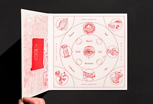
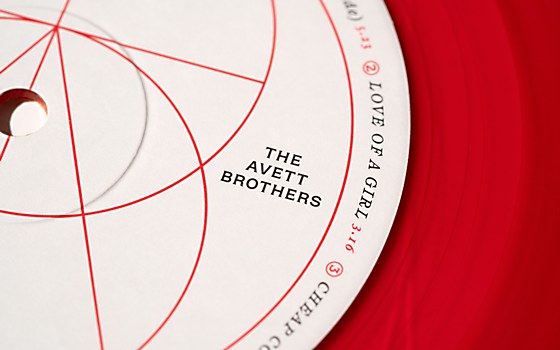
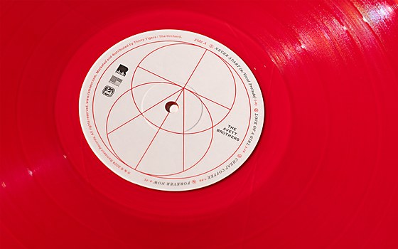
Favorite details: The album diagram on the inside jacket is a favorite. It’s always such a treat to design a weird chart or diagram, and it’s especially satisfying when you’re able to transcend the aesthetic and make something functional and meaningful. Given the poetic nature of this project, there’s a layer of abstraction that opacifies the meaning in the diagram a bit, but the placement of the different elements in relationship to one another, the diagram lines and the text was extremely methodical. The diagram began as a cleanup of a chart the band drew during our in-person brainstorming workshop about The Avett Brothers’s ideas and influences and turned into a map of the album’s motifs.
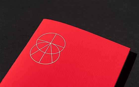
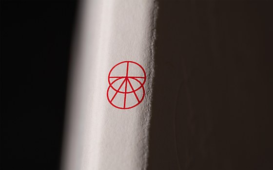
We also absolutely love the symbol—which was an eleventh-hour addition—that’s used widely across the assets. It contains so many nested images, as well as a secret monogram, and really amps up the mystical vibe.
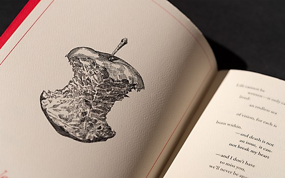
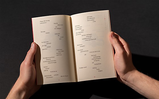
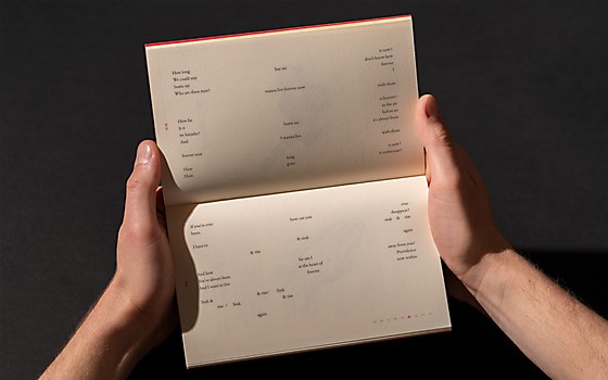
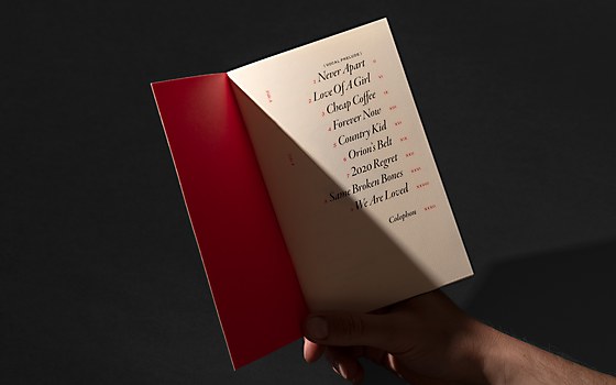
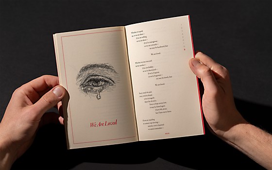
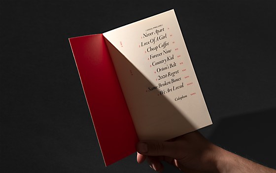
Visual influences: Hermetic diagrams and charts are an obvious but bountiful resource. As we dove deeper though, we also started looking at vintage Bibles for inspiration; they do all kinds of surprising and weird but beautiful things with typography and layout that we brought into many of the album’s details. There was one old Bible from a team member’s mom’s attic that had these bizarre tiny spur-seriffed numerals in the outer margins labeling the verse numbers; we drew on that for the track numbers in the margin of the lyric chapbook.
Alternate paths: Originally, there had been ideas to build out an entire microsite for the album with an exclusive digital experience, alongside “album objects” that connected to the music and the digital experience. During the workshop, we’d brainstormed a bit about what the objects could be and the kinds of stories they could tell, but with release, tour, and product costs and timelines, we weren’t able to bring them into the world. So, if we could start over, it would have been amazing to set up the project in a way that we could have made it happen.


