Responses by Tom Hingston, founder and creative director, Hingston Studio.
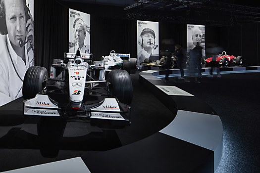
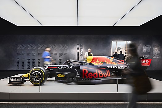
Background: This exhibition presents an interactive and immersive journey through the world of Formula 1 (F1)—past, present and future. Designed to engage wider audiences beyond core F1 and motoring fans, the show plays into the increased interest in the sport as entertainment, its drama fueled by feature films and TV documentaries such as Drive to Survive. A multilayered narrative, the show embraces history, technology and design and explores some of the characters integral to the success of the sport as we now know it.
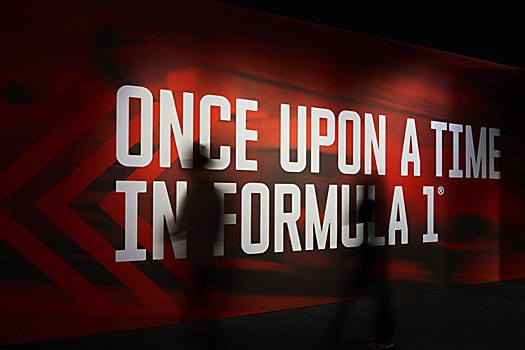
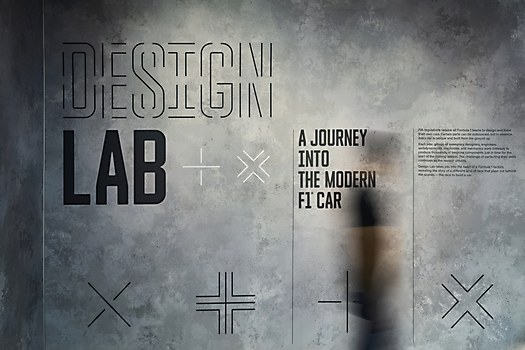
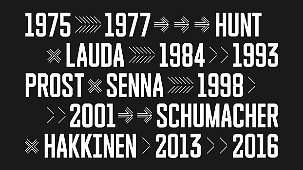
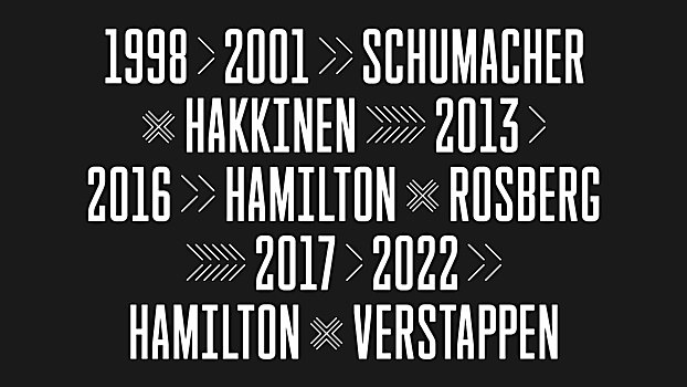
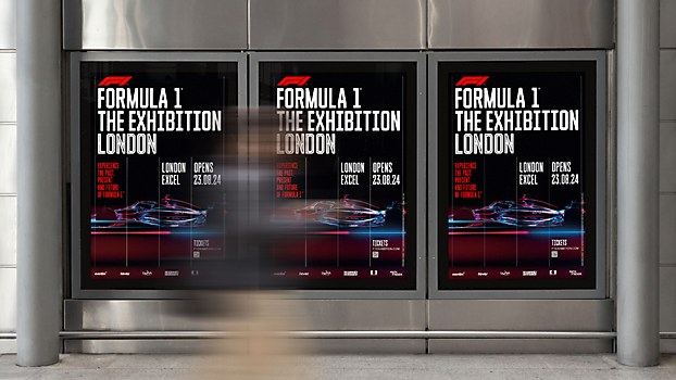
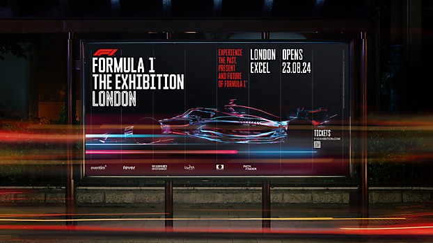
Design thinking: Taking a typographic approach enabled us to create a hierarchical structure—a visual system where visitors could interface with information on different levels. There is a top tier, in which bite-size chunks of information appear at scale, this is then supported by lower-level, secondary information providing greater detail should the viewer decide to drill down further.
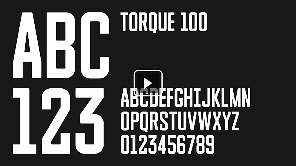
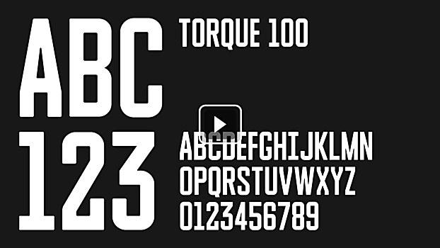
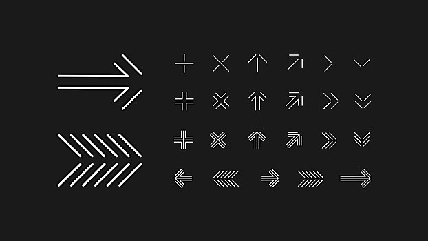
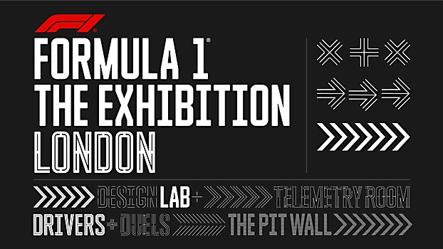
A unique family of bespoke headline typefaces we designed form a central part of the visual identity and supporting typographic system, comprising three different cuts—Torque 100, Torque 50 and Torque Inline. This typographic approach ensures that every information touchpoint carries the show identity, however subtle—it’s essentially embedded into the whole system.
Challenges: The story of F1 up to present day is a complex, layered narrative, so the exhibition’s information architecture was key. There is a wealth of information for visitors to digest as well as the varying subject matter, from the history of the sport, the process of innovation and engineering to the personalities of individual drivers.
Favorite details: We wanted to create a typeface that was robust enough to take on different visual treatments, such as the individual room names for instance. Each room (or space) within the exhibition features its own sub-identity, where the letterforms themselves take on the inherent characteristics of the room’s theme, but essentially, the construct of the font is the same throughout the show. It’s a nice detail as visitors move through the show and it also allows for the additions of newer rooms in the future, as the show continues to travel and evolve over the next ten years.
Visual influences: In the early stages of the project our team researched poster design from the sport’s golden era of the 1960s and ’70s. It’s a hugely inspirational period of design in any case—but the posters, magazine covers and other ephemera designed for F1 are so incredible. Dynamic typography and layouts, vibrant color palettes, wonderful photography, and illustrations—everything sparks a feeling of excitement and energy. So, we were keen capture some of that essence, creating a typographic identity that evoked power and modernity.
New lessons: The whole project was a huge learning curve, but one particularly interesting point was around understanding more about the exciting transition that F1 is currently undergoing. The audience is much wider, more mixed and diverse, and the sport is really embracing that shift. For instance, there are a lot more female fans then there were ten years ago. Shows like Drive to Survive have been a major catalyst for that change. Consequently, this all fed into shaping our creative process.
As a studio, we’ve always embraced projects that present new challenges and complex problem solving—quite often the learnings and experience gained in those instances can be applied in other areas of our practice. To some extent, this project was a learning curve for all involved—us, production company Round Room and F1. We’ve also always thrived on projects that enable us to work at scale.


